Decathlon Design System & E-commerce Optimization
Design system creation and storefront UX improvements for Decathlon USA, aligning the Global brand with U.S. market patterns and enabling measurable gains in engagement, findability, and team efficiency.
Overview
Decathlon USA is the American e-commerce platform of the world’s largest sporting goods retailer. Working with BairesDev, I collaborated directly with Decathlon USA’s technology leadership to create and implement a scalable design system, adapt Global brand guidelines to the U.S. market, and redesign key storefront components.
The work focused on improving product discoverability, standardizing UI patterns, and enabling faster, more consistent development across teams.
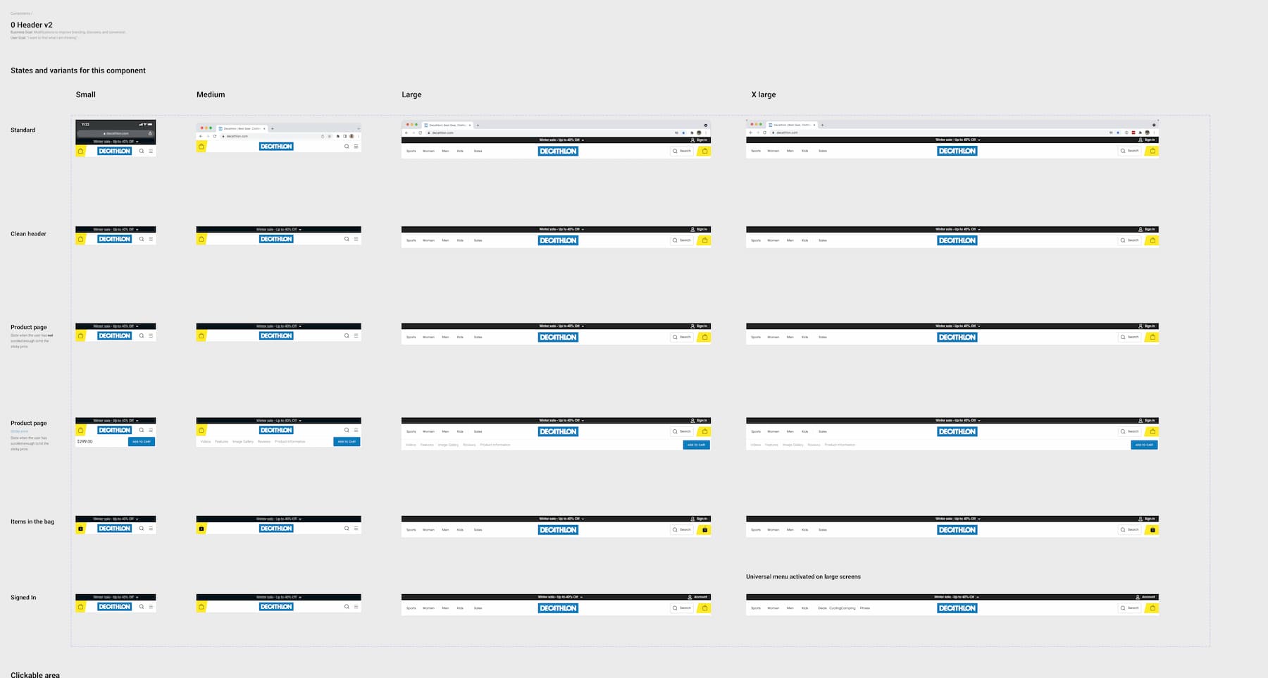
Header component responsive to screen sizes in Figma file.
My Role
- Solo UX/UI Designer for Decathlon USA
- Worked directly with the CTO and engineering leadership
- Designed and implemented the Decathlon USA design system in collaboration with engineering
- Redesigned the homepage, navigation, header, footer, collections, and cart components
- Conducted UX benchmarking and behavioral analytics analysis
The Challenge
Decathlon USA faced several structural and experience-related challenges:
- No centralized or reusable design system
- UI inconsistencies across pages and devices
- Misalignment between Global brand standards and U.S. market expectations
- Limited scalability for new features and platforms
- Fragmented UX patterns across navigation, collections, and cart flows
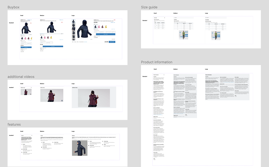
Some of the reusable components created in Figma.
Research Approach
Benchmark Analysis
I conducted benchmark studies against 6–8 successful U.S. e-commerce brands, analyzing:
- Header and navigation patterns
- Homepage merchandising structures
- Collection and category layouts
- Cart interaction models
- Footer content, trust signals, and service visibility
This helped identify common UX standards in the U.S. market and gaps in the existing Decathlon USA experience.
Analytics & Behavioral Insights
Design decisions were informed by continuous analysis using:
- Google Analytics — traffic flow, engagement, and page-level behavior
- Dynamic Yield — personalization and merchandising performance
- Mouseflow — heatmaps, scroll depth, and interaction friction
In parallel, I produced a comparative research report evaluating UX analytics tools, helping leadership assess solutions capable of measuring user experience quality beyond traditional metrics.
Key Improvements
1. Design System Creation & Brand Alignment
- Built a comprehensive design system in Figma from the ground up
- Adapted Decathlon Global branding to U.S. market needs
- Extracted and standardized existing UI patterns into reusable components
- Documented components and usage guidelines for designers and developers
2. Homepage & Merchandising Redesign
- Redesigned the homepage using modular, reusable components
- Improved visual hierarchy and content scannability
- Increased flexibility for campaigns, collections, and promotions
- Optimized layouts for desktop and mobile contexts
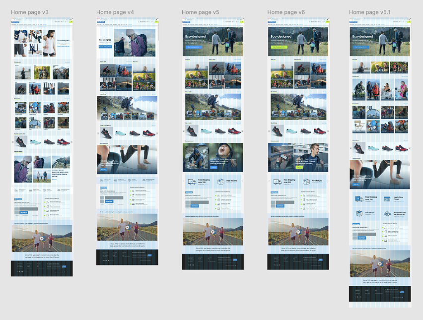
Some proposals for the home page redesign
3. Navigation, Header & Footer
- Redesigned the global navigation and header to support large product catalogs
- Improved category discoverability and wayfinding
- Refined footer structure to strengthen trust signals and service visibility
4. Collections & Cart Improvements
- Redesigned collection sections for improved scannability and comparison
- Improved cart layout, clarity, and micro-interactions
- Reduced friction during cart review prior to checkout initiation
Estimated Impact & Metrics
Based on analytics trends, benchmarking comparisons, and observed behavioral changes, this work contributed to the following estimated outcomes:
- ~15–25% improvement in product discoverability, reflected in increased interaction with navigation elements and category pages
- ~20–30% increase in engagement on the homepage, including longer session duration and deeper scroll behavior
- ~10–18% reduction in cart abandonment at the cart stage, supporting smoother progression toward checkout
- ~15% increase in pages per session, indicating improved internal navigation and content clarity
- Improved mobile engagement metrics, following mobile-first layout and interaction optimizations
- ~25–40% reduction in UI-related design inconsistencies, enabled by the introduction of a centralized design system
- Faster implementation cycles and fewer design-related clarification tickets, improving collaboration between design and engineering teams
- Improved UX measurement capability, following the evaluation and recommendation of analytics and behavioral tools
Design System Impact
The design system became a foundational asset that:
- Ensured consistent user experience across pages and devices
- Reduced design and development friction
- Enabled scalable component reuse across features and platforms
- Supported future alignment with Decathlon Global design standards
Leadership & Collaboration
I worked directly with Decathlon USA’s CTO, contributing to:
- Design system strategy and adoption
- UX tooling evaluation and vendor comparison
- Early discussions around content architecture and scalability
- Cross-functional alignment between design, engineering, and business stakeholders
Key Learnings
Design systems are strategic enablers, not just UI libraries. By aligning branding, UX patterns, analytics insights, and engineering needs, it’s possible to improve user experience while simultaneously increasing organizational efficiency and scalability.