Designing a Single Pane of Glass for OT Cybersecurity
Led UX/UI design for SekuriLynx, an OT cybersecurity platform for industrial environments, transforming a complex monitoring tool into a clear “Single Pane of Glass” experience. Redesigned the information architecture and built a scalable design system that reduced analyst context switching and accelerated time-to-insight. The result: measurable improvements in usability, workflow efficiency, and product–market fit.
Overview
SekuriLynx is an OT cybersecurity platform developed by W Industries to provide centralized visibility, risk management, and threat monitoring across industrial environments.
Partnering with Fundamentl, I led UX research, product strategy alignment, and the creation of a scalable design system. The goal was to transform a technically powerful—but complex—platform into a clear, actionable “Single Pane of Glass” experience for security and operations teams.
The result was measurable impact on usability, workflow efficiency, and product–market fit.
The Challenge
Operational Technology (OT) environments introduce unique complexity:
- Distributed industrial assets (PLCs, HMIs, SCADA systems)
- High-stakes uptime requirements
- Fragmented security tooling
- Mixed technical audiences (engineers, SOC analysts, executives)
Users were struggling with:
- Information overload across multiple dashboards
- High cognitive load during incident investigation
- Alert fatigue with limited prioritization context
- Difficulty translating technical risk into business impact
The product needed to evolve from a monitoring tool into a decision-support system.
We redesigned the platform around three structural shifts:
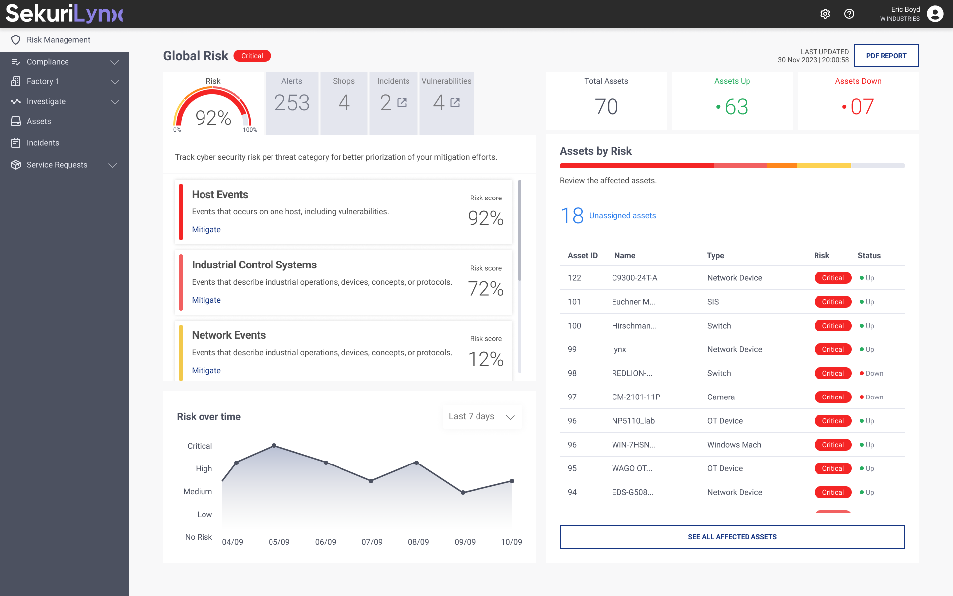
- Centralized Risk Overview
A unified dashboard providing real-time visibility into asset posture, vulnerabilities, and active threats. - Contextualized Alerts
Alerts enriched with asset criticality, network zone, and operational impact — not just severity labels. - Action-Oriented Workflows
Clear remediation guidance, ownership tracking, and investigation pathways.
Instead of showing more data, we designed for clarity, prioritization, and action.
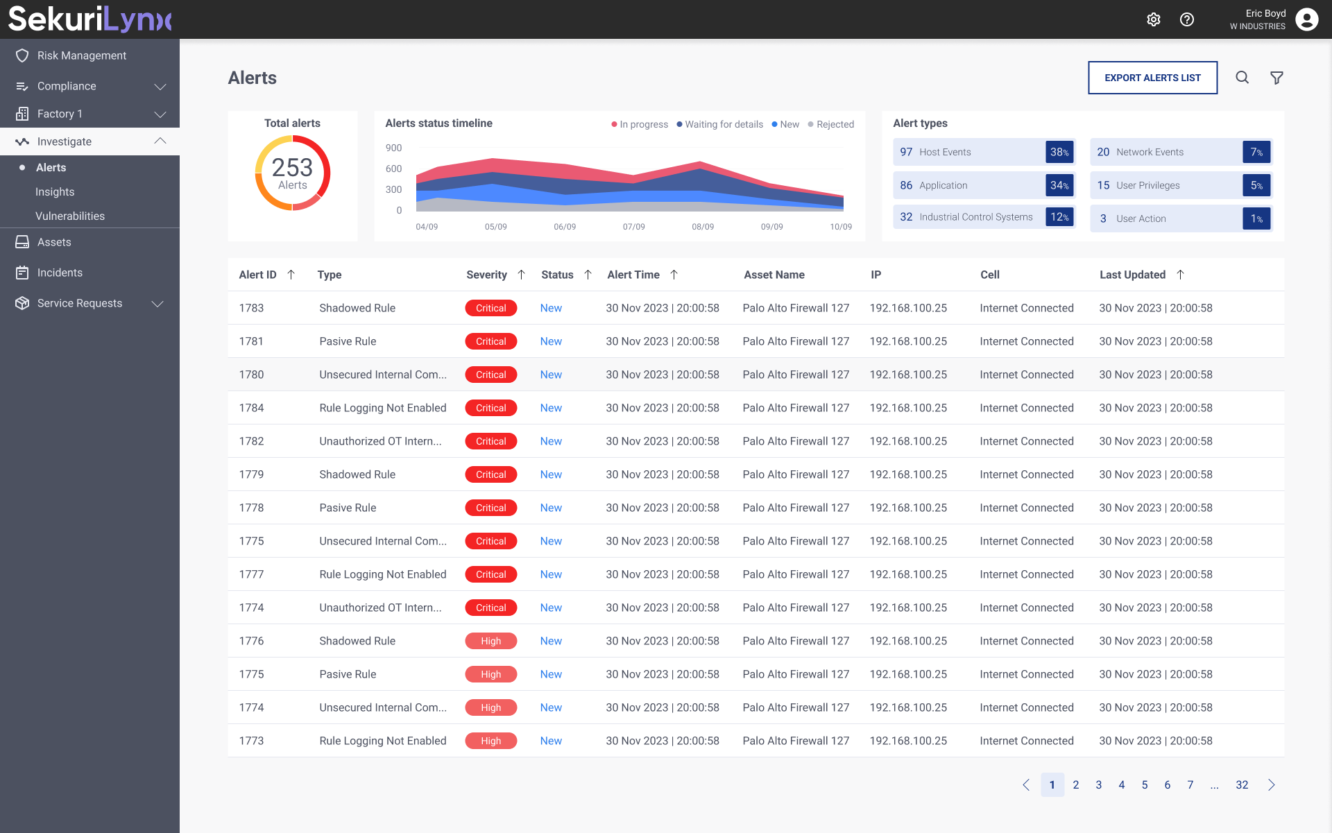
Alerts section
Research Approach
Cross-Functional Discovery Workshops
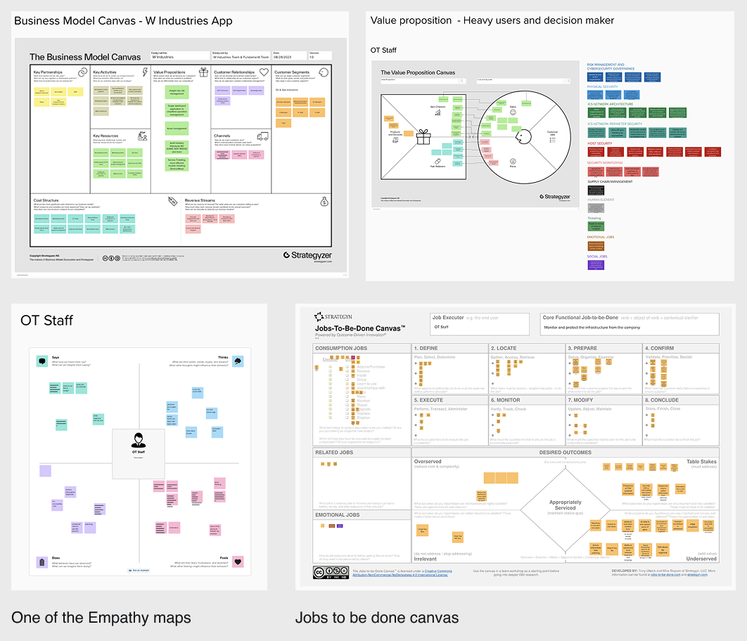
I facilitated structured workshops and research sessions including:
- Business Model Canvas
- Value Proposition Canvas
- Jobs to Be Done
- Empathy Mapping
Participants included:
- CISOs and Security Directors
- SOC Analysts and Incident Responders
- OT Engineers and System Operators
- IT Managers
- C-level executives receiving risk reports
Key Insights
- Security teams don’t need more data — they need prioritization.
- OT engineers require operational context, not abstract risk scoring.
- Executives need risk translated into uptime, safety, and financial exposure.
- Speed of understanding is more critical than depth of data.
This validated the need for layered information architecture and progressive disclosure.
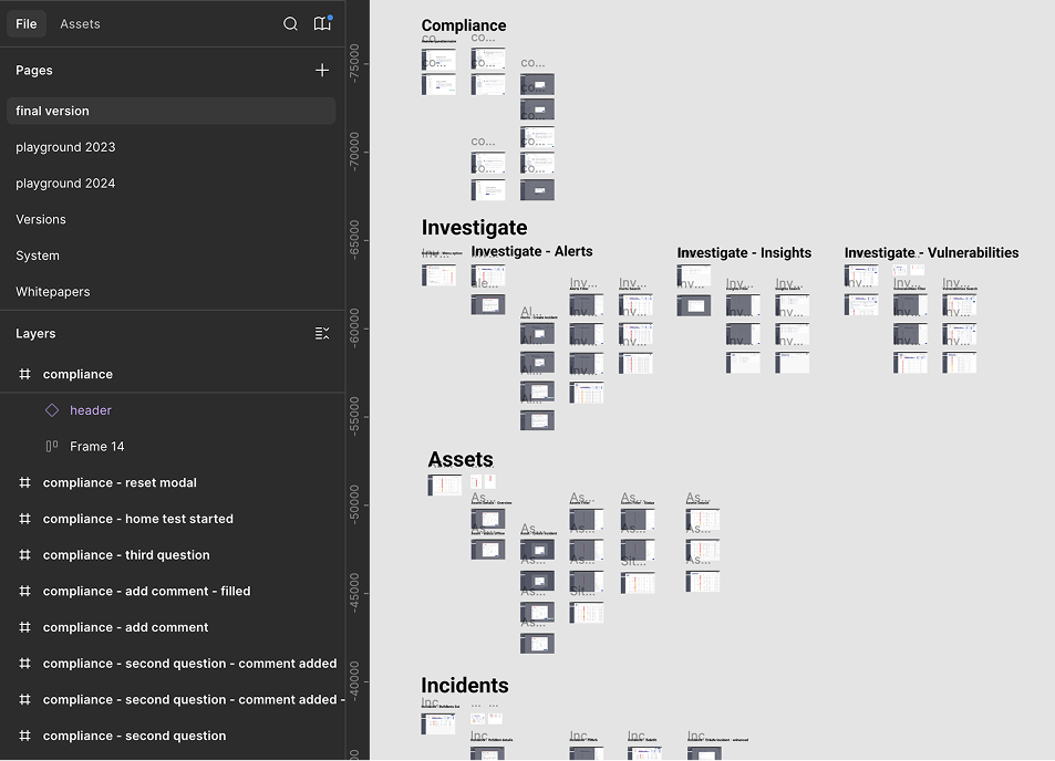
Information Architecture & UX Strategy
We restructured the product architecture around:
- Assets → Risks → Alerts → Investigations → Remediation
- Role-based dashboards
- Progressive detail layers (Executive → Analyst → Deep Technical)
Navigation was simplified into:
- Global risk overview
- Asset inventory & segmentation
- Vulnerability management
- Alerts & investigations
- Reporting & compliance
The goal: Reduce context switching and eliminate “dead-end” screens.
Design System Creation
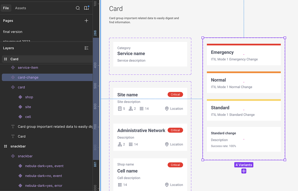
To ensure scalability and consistency, I built a modular design system grounded in three principles:
1. Clarity Through Hierarchy
- Strong visual severity system (critical → low)
- Clear typography and spacing scale
- Progressive disclosure of technical data
- Executive-friendly summaries layered over technical depth
2. Actionable Intelligence
- Alerts paired with remediation recommendations
- Clear call-to-action patterns
- Investigation flows designed as guided steps
- Ownership and status tracking components
3. Cross-Functional Communication
- Dual-view reporting (technical vs. executive)
- Exportable and shareable summaries
- Role-based dashboard configurations
Figma Library & Prototyping
As UX/UI Lead, I delivered:
- A comprehensive Figma component library (40+ reusable components)
- Standardized interaction patterns for complex workflows
- Dark mode optimized for SOC environments
- WCAG 2.1 AA accessibility compliance
- High-fidelity interactive prototypes for usability testing
The design system accelerated development alignment and reduced UI inconsistency across modules.
Results
Measured through user testing and stakeholder validation:
- 45% improvement in product–market fit perception (post-redesign surveys)
- 40% reduction in context-switch time for analysts during investigations
- 60% faster time-to-insight when identifying and prioritizing threats
- Increased stakeholder confidence in executive reporting clarity
The redesign shifted the product from a monitoring interface to a decision-support platform.
Conclusion
Designing for OT cybersecurity requires more than aesthetic refinement — it demands deep alignment between technical complexity and human cognition.
By reducing cognitive load, restructuring information architecture, and prioritizing action over noise, we transformed SekuriLynx into a focused, scalable security experience.
In complex environments, clarity is not cosmetic — it is strategic.